Google announced its new design language in May. Material 3 Expressive redesigns have been slowly rolling out to Google apps since then, and here’s our list of what’s available and still to come on Android phones.
Rolling out
Google Calendar
Time slots (hours and days) are placed in their own rounded container throughout the app’s various views (Day, Week, Month). This replaces the faint lines used previously, while there’s now a solid background layer in the primary Dynamic Color.
Google Contacts
This straightforward redesign places everything in containers, while the bottom bar is now shorter. There are also color tweaks to the app’s background.
Digital Wellbeing
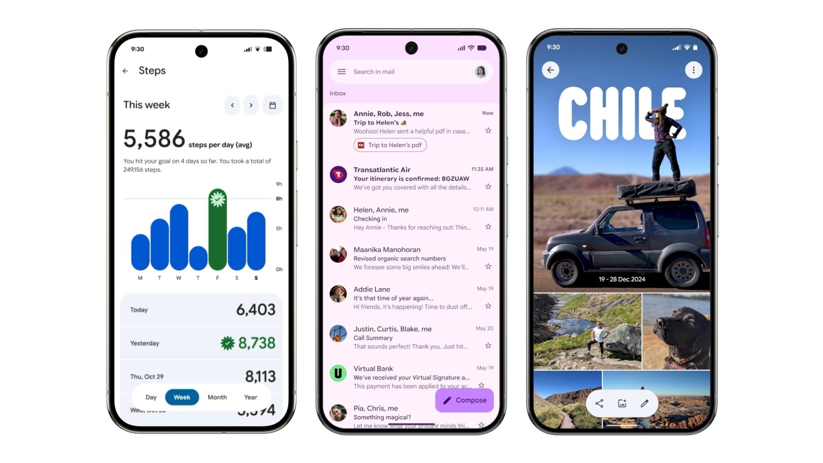
Just the main page for this “app” (within Settings) has been updated with M3 Expressive. Besides containers, the donut graph is thicker. This is rolling out with beta version 1.30.x.


Google Photos
A new backup indicator at the top of the app replaces “Google Photos.” On launch, you briefly get a logo that animates into “Backup complete.” You can drag down (pull-to-refresh) to see cycling Material 3 Expressive shapes on a background layer that also notes how much you have stored in the cloud. When something is backing up, there’s a wavy progress indicator.
Google One
The app switches to a shorter bottom bar, while the cards (and Settings) are placed in more prominent containers. Meanwhile, Google One has removed its infographics for a denser app.
Phone by Google
Compared to other apps, Phone by Google is using Material 3 Expressive as an opportunity for a complete overhaul. The bottom bar goes from four tabs to three with Favorites and Recents becoming “Home.” There’s a new “Keypad” tab that replaces the FAB, while “Voicemail” is unchanged. Contacts can now be found in a navigation drawer. All calls and lists (including Settings) make use of containers.
The Incoming and In-Call screens feature updated buttons with larger touch targets. You can pick between Horizontal swipe or Single tap.
Google Keep
Google Keep makes use of the new M3 Expressive search app bar component that moves the hamburger button and profile switcher outside of the search bar, which is now thicker. The other main update is on the notes page with all buttons (Archive, ‘plus menu, overflow, etc.) placed in containers.
Google Wallet
“Wallet” has been replaced by the app logo in the top-left corner, while the list of passes below the carousel makes use of thicker cards. The Recent activity page has been updated with containers.
Google Messages
The list of conversations and message thread itself is now placed in rounded containers. Google has also redesigned the ‘plus’ menu with all the options placed in pills. Other parts of the app getting Material 3 Expressive include New chat, Search, and Settings.


Gmail
Your list of emails and the message are placed in a container, while there’s a prominent pill-shaped animation when using the swipe gestures.
Launched
Google Meet
Google Meet is the first app to have widely rolled out a Material 3 Expressive redesign. On the homepage, each call is placed in a large/tall card as part of M3E’s heavy use of containers.
The pre-call screen sees more M3 Expressive with very large voice and video call buttons that seem out of proportion. The name, picture, and email address of who you’re calling is placed in a pill and centered at the top. Various buttons go from circles to rounded squares.


FTC: We use income earning auto affiliate links. More.
Source link


