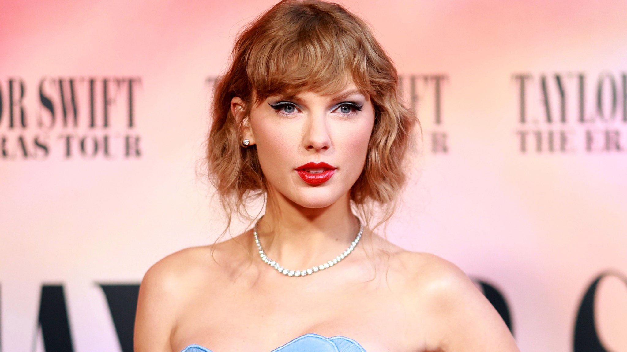
Photo: Emma McIntyre/TAS24/Getty Images
Earlier this week, Taylor Swift made her debut appearance on New Heights, a podcast hosted by her boyfriend, NFL star Travis Kelce, and his brother Jason. She used the opportunity to pull a sparkly orange vinyl out of a pale mint record case, thus revealing her 12th album and latest era. The cover features a portrait of Swift in a diamond dress, partially submerged underwater. Photographed by longtime collaborators Mert Alas and Marcus Piggot, the image is framed by collaged snapshots of Swift’s body as if refracted like a mirror ball. Glittery orange letters spell out the title: The Life of a Showgirl.
As is her custom, Swift planted Easter eggs far in advance of this announcement and the album’s October 3 release date. Detail-oriented fans noticed that her tour wardrobe increasingly featured orange outfits, including during a duet with Sabrina Carpenter, who features on the title track. Swift also revealed that she left a “subliminal hint” for fans during the final Eras Tour concert by exiting through an orange door rather than her typical elevator lift. “I may be leaving the Eras Tour era, but I was also entering a new era,” she said of the symbolism.
Swift produced the entirety of The Life of a Showgirl alongside Swedish hitmakers Max Martin and Shellback, who worked on Red, 1989, and Reputation. Songs from those three albums feature exclusively on a Spotify playlist she shared, suggesting that TS12 will be capital-P pop, as opposed to a more “esoteric” endeavor. Travis Kelce called the album “upbeat,” and Swift described the album’s “effervescence” as reflecting “the most infectiously joyful, wild, dramatic place I was in my life.”
Orange Energy
As for the orange, Swift explained that the color captured “energetically, how my life has felt. And this album is about what was going on behind the scenes in my inner life during this [Eras] Tour, which was so exuberant and electric and vibrant.”
Color experts can relate. “Orange is the social color, cheerful, luminous, and warm rather than hot, like red,” color consultant Faber Birren wrote in 1984’s Color & Human Response. “Orange personalities are friendly, have a ready smile and a quick wit, and are fluent if not profound in speech.” Although orange seems to be at the forefront of this new Swift era—and the color dominated the discussion during her podcast appearance—the hue really only appears as a flourish on the album cover. The hazy turquoise of the water surrounding her takes up much more real estate, and now appears on her Spotify profile, Instagram, and more. So while it seems clear that the choice of orange represents the upbeat nature of this new chapter, what can we gather from the juxtaposition of these two hues?
Opposites Attract

The larger-than-life sets are Swift’s most impressive yet.
Set Design
As the singer continues her globetrotting tour, *AD* explores how Swift is paying homage to her past and the symbolism of her stage design
Since orange and blueish-green sit across from each other on the traditional 12-color wheel, the colors have opposite temperatures. “The pairing of orange and teal is a master class in complementary color dynamics,” says Erika Woelfel, vice president of color and creative services at Behr. “Vibrant warmth meets serene coolness. Orange communicates energy, confidence, and theatrical flair, while teal grounds it with depth, balance, and modern elegance. Together, they evoke both excitement and sophistication.”
“They make each other shine,” agrees Uchronia founder Julien Sebban, who, in his own home, opted for orange lacquer walls and a glossy blue ceiling. “Together, orange and turquoise feel vibrant yet harmonious—a burst of energy grounded by a moment of calm.”
Swift explained on the Kelce brothers’ podcast that every day on the Eras Tour ended in the bathtub, though she was not usually as bejeweled as she appears in the album artwork. The imagery of a barely offstage and presumably very sweaty body submerged into water further emphasizes the contrasting temperatures. Could the choice be a nod to the duality of a life lived both on and off the stage? (Or could the use of opposite colors be a nod to her relationship with Kelce?)
Given her commitment to numerology and general masterminding, Swift certainly considered color theory when defining The Life of a Showgirl’s signature shade. A sampling of previous albums shows how Swift uses colors to speak to the music’s overarching themes: cotton candy pink represented Lover’s romantic nostalgia, dark blue matched the moodiness of Midnights, and Red—well, Swift explained that one best herself. The distinct pairing of orange and blueish-green that defines The Life of a Showgirl suggests a balance of confidence and softness, an apt representation for Swift’s current life.
Originally Appeared on Architectural Digest
More Great Celebrity Style Stories From AD
Source link


