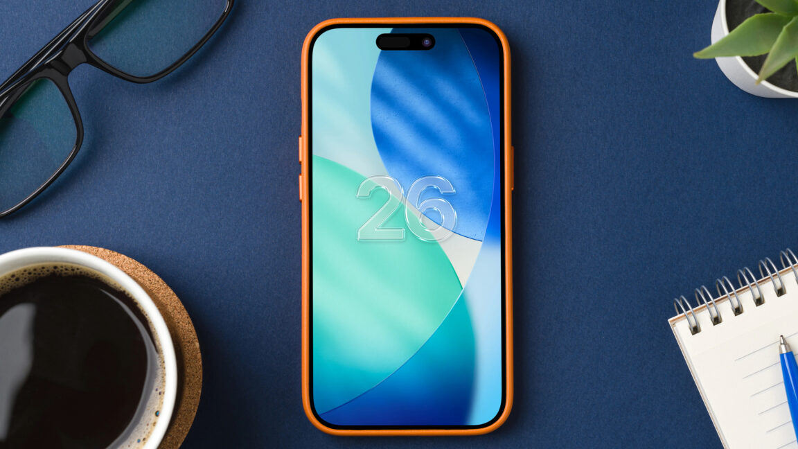
iOS 26 beta 4 has just been released, and one of the biggest question on many testers’ minds has been answered. After dialing back its redesign in beta 3, Apple has now infused more ‘liquid’ into the Liquid Glass design once again.
New iOS 26 beta offers refined Liquid Glass look
In iOS 26 beta 3, Apple scaled back the ‘liquid’ in Liquid Glass, leading many to refer to it as ‘Frosted Glass’ instead.
Opinions were mixed on the changed design, but many beta testers seemed disappointed that the original Liquid Glass look had been—in some cases—so drastically reversed.
But now in beta 4, the ‘liquid’ in Liquid Glass seems back in full force.
Here is a look at the App Store tab bar in iOS 26 beta 4:

For comparison, here are examples from betas 2 (top) and 3 (bottom):

As you can see, in the beta 2 and beta 4 images, the tab bar reveals much more of the content underneath it. In the beta 3 image, the opacity has changed significantly so it’s less transparent.
To my eyes, and in use, the design in beta 4 feels like a refined balance between the heavy liquid in the first couple betas, and the more frosted look in beta 3.
This shouldn’t come as a surprise, as Apple often uses its beta cycles to refine designs over time.
For another example, here’s a look at the tab bar in Photos running beta 4:

Today’s iOS 26 beta 4 release to developers is expected to be followed by a public beta version in the days ahead. As a result, it’s especially noteworthy what Apple decided to ship with its latest Liquid Glass design.
Clearly, the company’s goal is the original “liquid” vision more so than the “frosted” look of beta 3.
Have you installed iOS 26 beta 4, and what do you think of the updated Liquid Glass design? Let us know in the comments.
Best iPhone accessories
FTC: We use income earning auto affiliate links. More.
Source link


