Google TV’s homescreen has been largely unchanged since its debut in 2020, but Google is now testing a slight redesign that changes navigation.
The bulk of what you interact with in Google TV is the homescreen, which has made updates over the years often feel a bit stale. The last notable refresh came in early 2024, and it was basically just to move to circular icons. Now, though, we’re finally getting an update to the experience.
Showing up in what appears to be a server-side update on top of Google TV Home v1.0.806977084, this slight redesign affects primarily the top navigation bar on Google TV. The “Library” tab is removed, with the “For You” tab becoming simply “Home.” The “Live” and “Apps” tabs then appear in a pill-shaped box alongside a search button. In a second box, buttons for settings and the screensaver appear.
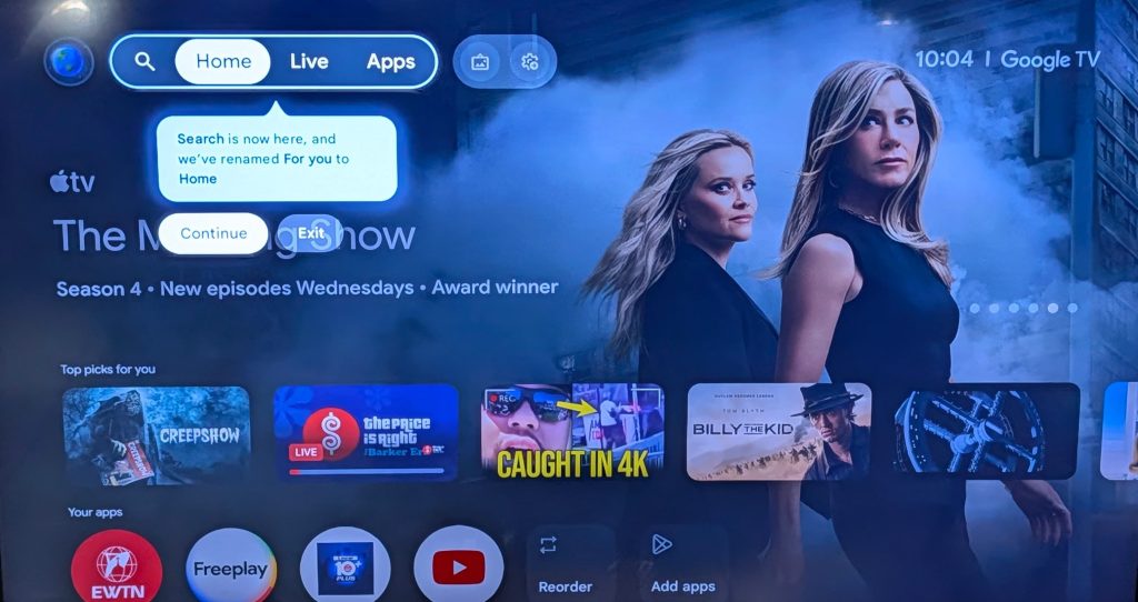
In another considerable change, the profile image on the far left side of the screen now contains a dropdown menu with a profile switcher and four buttons — Watchlist, Library, Your services, and Content preferences. Previously, “Your services” and “Content preferences” only appeared in the Settings menu under Accounts & Profiles.
This isn’t a groundbreaking redesign for Google TV by all means, but it’s the first real refresh we’ve seen over the past five years.
So far, we’ve not seen many reports of this redesign rolling out to Google TV users, so it’s likely Google is testing the refresh on a limited basis ahead of a wider rollout. If you’re seeing this update on your end, let us know in the comments below.
Thanks Sterling!
More on Google TV:
Follow Ben: Twitter/X, Threads, Bluesky, and Instagram
FTC: We use income earning auto affiliate links. More.

 Was Just Updated. Here’s Where It Stands.")
