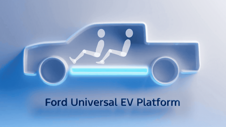
Ford is making a huge announcement as we speak, about a new electric car/truck platform that will be used for a wide variety of cars, but the thing that caught my attention was in the background, and was more than a century old: a logo. A Ford logo, of course, but one that hasn’t really been in use since the Model T-era. Which, based on what Ford CEO Jim Farley was saying, kinda fits.
The announcement today is essentially about a modular EV platform, which really isn’t that big news, since lots of companies use standardized modular platforms, EV and otherwise. But Ford is a little late to this, so it’s definitely a big deal for them, and, as is noted in our story about this, Ford is claiming theirs is even more modular.
![]()
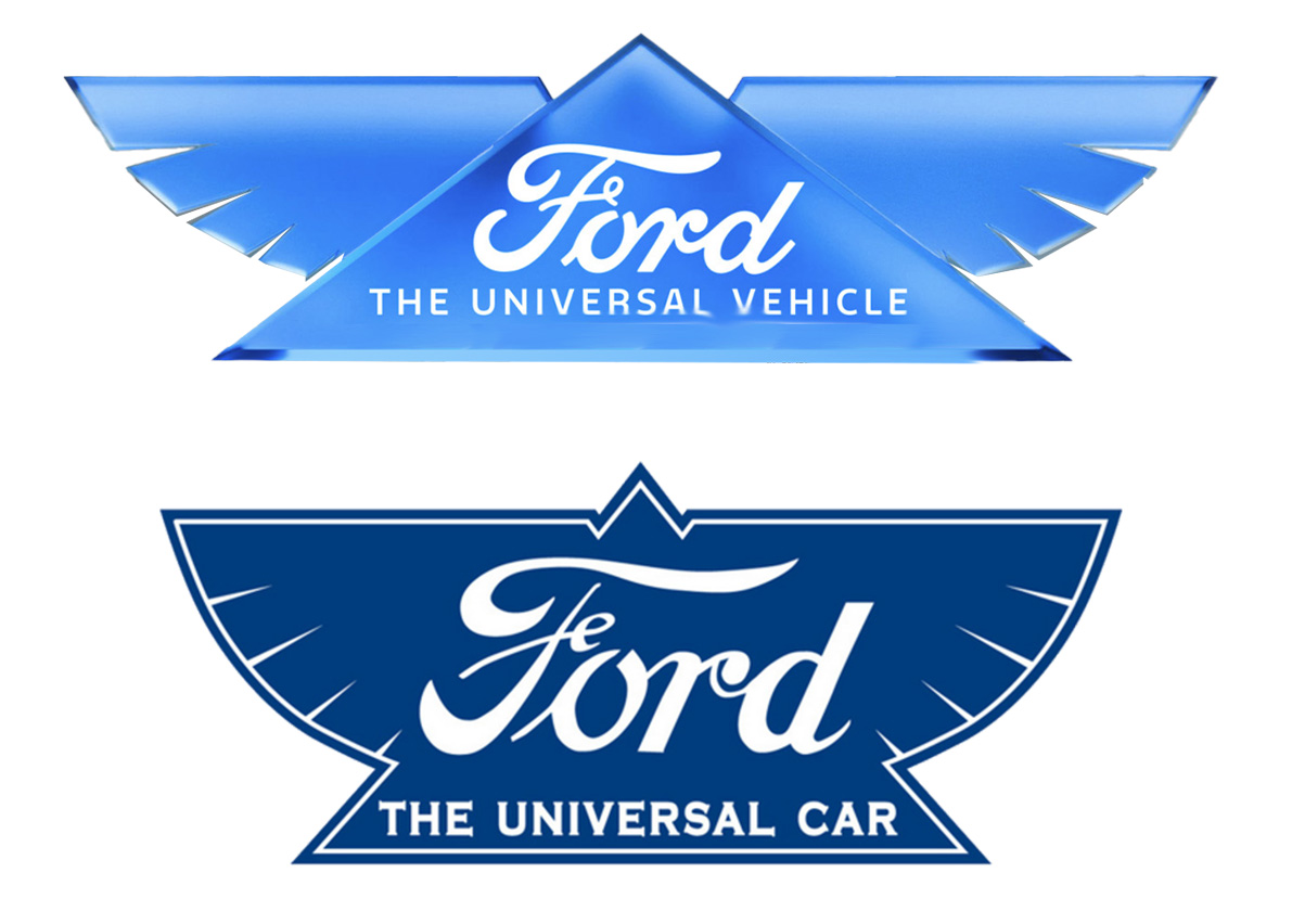
So, why the different logo? Well, let’s take a look at what that logo has. It’s the winged one that you see here:
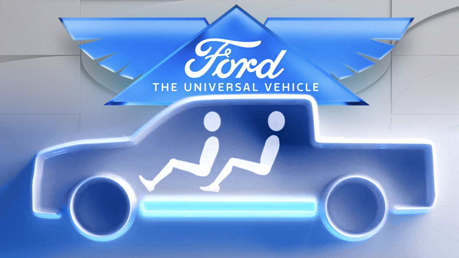
That triangle with wings and the traditional Ford script inside. At first glance, you might think this is some kind of Masonic thing, with a pyramid and mythic wings and all that, but it’s not, it’s actually a Ford logo from 1912:
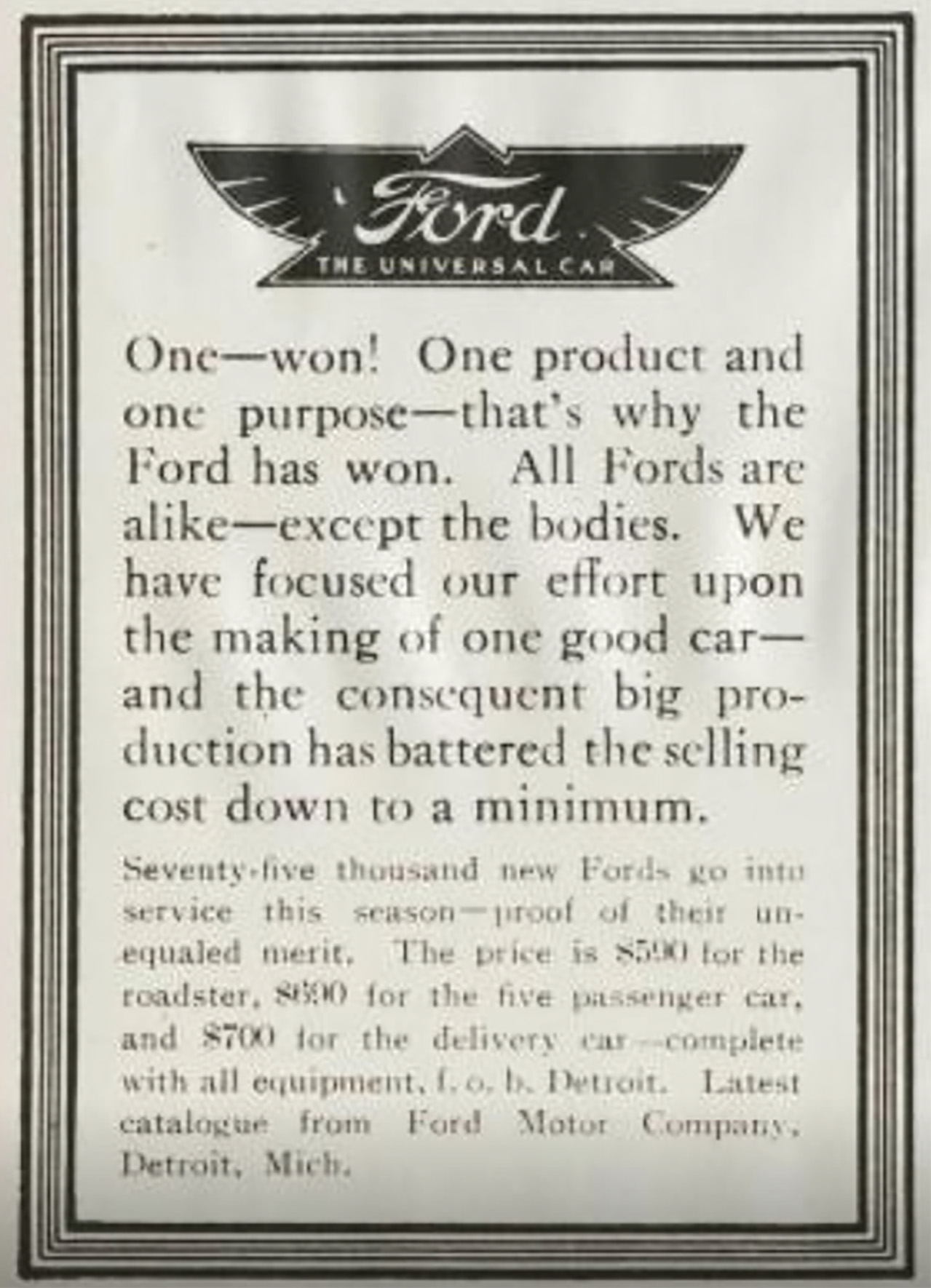
Here it is in a newspaper ad from 1912:
Here’s where it fits in the Greater Fordic Logo Evolution:
So, this predates the Blue Oval we all know so well, which was not defined until 1927. I like how the 1909 one is in quotation marks, suggesting maybe it’s not really a Ford.
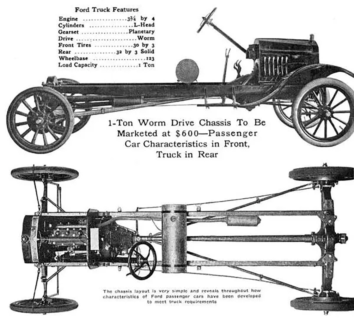
I think the key part here, why this old logo was revived, is the addition of the motto “The Universal Car.” This was referring to the Model T, which was very much a Universal Car. This was from an era long before deliberate modular platforms, but the Model T’s basic chassis and drivetrain did become something of a modular platform, with all manner of different bodies available for it:
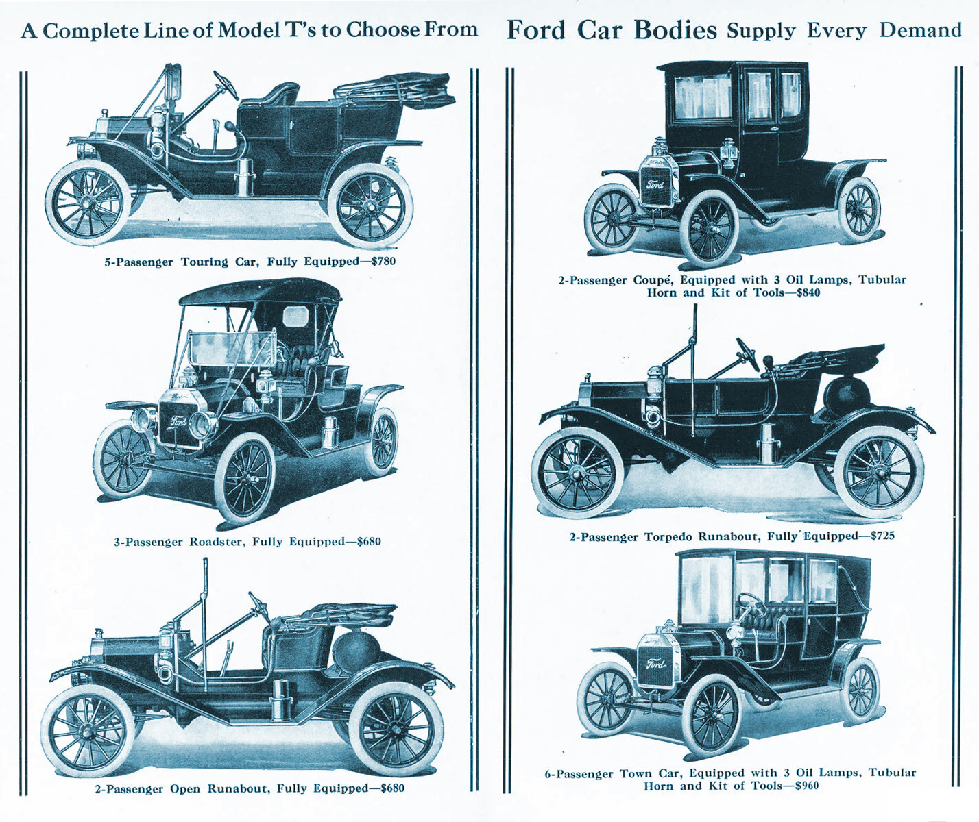
Back in the separate chassis/body era, before the Rise of the Unibodies, this wasn’t that uncommon. Think about how many different cars Volkswagen built on the basic air-cooled Beetle platform, for example. The Model T, of course, did this really well.
So there’s Ford’s first Universal Car. And they want to try it again, only in electric form:
I get it, it’s a great concept. And, it makes sense that Ford was a master of this over a century ago. It’s very convenient that they even had a motto and logo that reflected this idea way back in 1912, so I’m not too surprised they’re using the old pyramid-and-wings logo today.
Sure, it’s been updated a bit, but notably, the way it’s been updated is surprisingly pretty minor. It’s mostly limited to the look of the material the logo is “made” of, now all slick and shiny, fitting in with the current “Liquid Glass” trends. The triangular section is also now more distinctly outlined, and the wing proportions have gotten longer. Oh, and the “Ford” script is the modern variant of that long-lived logo.
But more significant is the change to the motto, now “The Universal Vehicle” instead of the more limiting “The Universal Car.”
I doubt that it’ll replace the famous Blue Oval, though? I suspect it’ll mostly be used in the context of cars built on this new modular EV platform. I can’t see it on, say, a Mustang. But will the winged script design be used on the badging of these new EVs? I guess we’ll have to wait and see. It could be pretty cool!
Source link

 Slips")