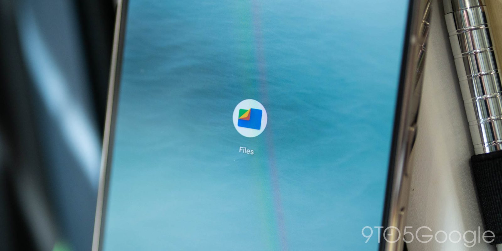
Files by Google is the latest first-party app to get M3 Expressive redesign. The general layout is mostly unchanged with this update focused on updating components.
The redesign starts with an animated Material 3 multi-browse carousel that uses “adaptive shape morphing and dynamic scrolling to create a parallax effect.” Like Google Photos, the image at the left is largest, the middle one has a medium-sized preview, and the right-most one is a vertical pill.
This component was first announced in 2023. The carousel is larger than before with the file name and folder taking up the entire bottom line, while the overflow menu is now placed in a pill at the top-right corner.
Old vs. new


Files by Google has replaced the two FABs (floating action buttons) with what should be a centered toolbar for Quick Share and document scanning. This component is also present when viewing images to edit and launch Circle to Search (which has a sparkled magnifying glass icon).


The grid view makes use of rounded square previews, while lists feature larger previews at the left.


Meanwhile, Files use a navigation rail on phones. It’s narrower than before and makes for an interesting look on mobile.
This M3 Expressive redesign is rolling out to stable (1.8278.x) and beta (1.8436.x) users of Files by Google. It’s appearing on several devices we checked this morning but not all. Try a Force stop from App info.


More on M3 Expressive:
FTC: We use income earning auto affiliate links. More.
Source link

