After introducing the four-color glow, Google is beginning to roll out the next redesign of the Gemini overlay on Android.
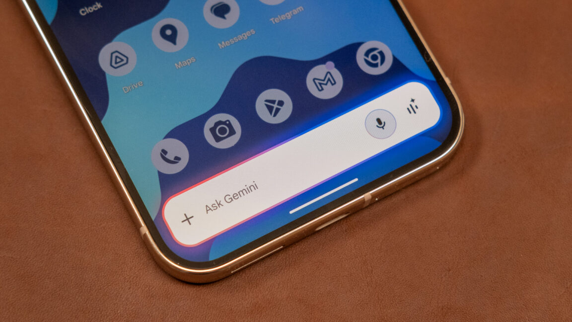
Instead of sliding up from the bottom of the screen as one bar, the new Gemini overlay redesign starts as a circle that comes in from just underneath the gesture bar. It quickly expands into a full-width pill that replaces the existing rounded rectangle design.
The change in shape is a bit curious as the current design lines up with the shape of the two-line Gemini prompt bar inside the full app.
There are no changes to the layout with a ‘plus’ menu at the left and “Ask Gemini” hint. There’s the voice input microphone and Gemini Live on the other side, while a drag handle lets you open the full app. The red, yellow, green, and blue glow remains the same.
Similarly, the “Share screen with Live” chip is now also a pill.
Overall, this design feels more bubbly and vibrant. (It’s a bit like the Gemini Live waveform.) In comparison, the old animation feels a bit stilted and blocky. One downside might be how it has the same general design as Circle to Search.
This Gemini overlay redesign is seeing limited availability today, but is hopefully launching sooner than later. It follows the last redesign from the tall rectangular card in January.
More on Gemini:
FTC: We use income earning auto affiliate links. More.
Source link


